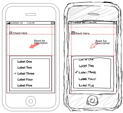
The longer I do this “business analysis” thing, the more convinced I become of the notion one of the surest ways to ensure project success is to get “pictures” in front of the users/stakeholders as early in the process as possible.
Kulak & Guinney tell us that,
The requirements specification does not provide the users with a cohesive view of what the system will accomplish; it is merely an itemization of each of the various functions.
The “itemization” has its use, but for customers it is a little like going to the restaurant and seeing recipes for the various items on the menu instead of images of the delicious end product. I might be able to tell from the recipe whether or not I’d like it, but I would have a much better idea if I had that picture.
As a customer, I don’t want to have to work that hard to tell whether or not I like what I see, and as a customer, I shouldn’t have to.
Bottom line – we often make our customers work much harder than they should have to in order to get a contextual view of what we think the end product will look like.
And when I say “pictures” I am referring to rough sketches, mock-ups, diagrams, prototypes – any tool that takes requirements and puts them in a form that is more familiar to our customers.
Robert Wittig goes a little more into the psychology behind how we process an essay as opposed to a picture (emphasis mine).
When we read an essay, we attack it a few words at a time, we do not consciously try to ‘see’ the whole essay at once, the way we at first view a picture. There is an interesting difference here, in how our consciousness manages these two different tasks. With the essay, it starts with the words, the small bits of information, and slowly builds upward toward full understanding of the whole. With a picture, it starts with the whole picture, and gradually works its way down into the details. Our consciousness cannot hold either an entire essay or an entire picture in its consciousness at one time. For some reason, it prefers to approach these two tasks from opposite ends.
Wittig’s description of how we process pictures differently than words is precisely why it is so important to give users visual models early. We don’t want them to have to begin with the details and try to construct the whole of the product mentally. As it is, natural language is ambiguous and can be interpreted in many ways even when we take every care to minimize ambiguity.
Instead, let’s provide a rough sketch of the big picture – something that resonates with the user or business stakeholder, and something they don’t have to work so hard to understand – and iteratively refine it until it becomes a solution that will delight the customer. Visual models are much less ambiguous than words alone.
To be clear, I am not inferring that we ought not do requirements in written form, only that they should be supplemented – as early as possible – with other models that help customers understand them. As the visual models are refined, the functional specification or use case is refined in serial.
A customer is much more likely to engage in the review process when they feel that they understand the materials they are asked to review. When we hand them a BTD (big thick document) and tell them we want their feedback at the meeting in 3 days, we are doing them and ourselves a disservice.
After all – how much do you, as an analyst, look forward to peer-reviewing your teammates 190 page document that’s packed to overflowing with colorless “system shall” statements?
More to come on visual models, and maybe a few ideas on how they can be used to in concert with textual specs, but I wanted to get this out sooner than later. Been much too long since I last posted!


JB:
Only in the last couple of years have a I begun to "come around" to the value of visuals for the audience to review and understand what I deliver. For may years, I think, in retrospect, that I took it personally that my reviewers were not reading the efforts of my labor. However, you're correct. When I ask myself whether I'd like to read my diatribe, it's a resounding "No!" I hear.
That being said, I do think that proper documentation has a very cozy relationship aside visuals and that the two should go together. Visuals alone capture the surface and struggle to define what's occurring underneath the surface. Documentation dries out one's eyelids but does provide a venue to capture things that cannot be described in a visual. As with anything else in life, a healthy balance between the two gives the satisfying experience for any type of audience…..including the analyst …..who now has someone that will actually read what is produced.
Doug
I'm with you, Doug. It's important to have the detail because skimping on the detail can get you in trouble in other ways. It's just that I think there is a lot we can do to make our deliverables more – palatable – not to mention more easy to understand.
One of my team members has tried screen mock-ups with text call-outs for some of the details. They have been very well received by business stakeholders, and are easier for the BA to speak from in terms of describing the functionality. The mocked-up screens with call-outs adds seems to add a needed dimension of context/color to the "BTD".
I could not agree more! People are very visual and describing things, even very well, can still leave things up to their own interpretations for the details. I make it a point to have a mockup of the product or process as soon as possible after the requirements have been gathered in order to help the customer truly understand what I am talking about. It eases a lot of fears and clears up communication time for more important questions.