I’m becoming more and more a believer in the value of modeling and visualizing requirements. I was trained in the more traditional methods of eliciting and capturing requirements, and have seen success doing things that way, but I am quick to admit that a picture truly is worth a thousand words (or is it a mock-up is worth a thousand “system shalls”?)
In this post I’ll share a few great links and quotes on rapid UI prototyping that have helped reinforce the value of visualized requirements in my mind, and that I thought you might find interesting.
Now, bear in mind that prototyping can be as simple as the mock-up on a paper napkin, and as complex as a fully functional prototype that actually evolves into the end product. As a business analyst, my interest and focus will tend more toward simple wireframes and mock-ups that I’d use to draw out additional requirements and to set design on a solid path. So, on to the good stuff –
- In an excellent read highlighting the shortcomings of traditional requirements gathering techniques and the importance of collaborating to conceptualize solutions, Andrew Gordon shares the following on UI prototypes:
Use cases are okay, but there’s no substitute for putting, at least what looks like, a real solution in front of stakeholders. In my experience UI prototypes validate system requirements better that any process modelling or workshops could ever do.
- The Pierson Requirements Group claims their customers are:
[A]ble to capture 93 – 95% of the business requirements functionality by using a collaborative requirements method and by creating and validating paper prototypes with the business community… If a more traditional interviewing approach is used to gather requirements, studies show that only 65% of the requirements will be captured.
- Charles Field blogging at Pathfinder finds that,
[A]nnotated pictures are far more specific & engaging than trying to describe with only text things that can be easily shown. If that adds pages to the document, it is a small price if it gets read and understood.
- Here’s a great article on prototyping. I includes some tips on effective prototyping and a great grid comparison list of rapid protyping tools. It includes all the more popular apps and some interesting ones I hadn’t heard of.
- Looking for example wireframes? Here’s a website (and corresponding Flickr group) devoted to the topic. And while I’m on Flickr, here’s another group dedicated to user experience sketches.
- I’m actually evaluating Balsamiq Mockups right now, myself, and will be sharing my thoughts on it and a few others off the list that I’m familiar with in the coming days. I’ve also recently been made aware of another mock-up tool aptly named Mockup Screens. Both are extremely reasonably priced, and relatively feature-rich.
- If you really want to keep it simple – and free – and use Firefox, have a look at the Pencil extension. Per the Pencil Project’s homepage:
Pencil turns your excellent Firefox 3 browser into a sketching tool with just a 400-kilobyte installation package. Pencil will always be free and can run on virtually all platforms that Firefox 3 supports.
I’m going to stop the list there for now, although the web is full of great resources on requirement visualization/mock-ups/wireframes, or whatever you want to call it. That said, what other mock-up and wireframing productions do you use or recommend?
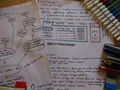
Mockup image by lilit


Jonathan:
I like the idea of visualizing, but constantly battling the tendency to provide the "How" as opposed to the "What" when gathering requirements really gets in the way many times. I'd like to hear your thoughts on managing this problem, which is exacerbated when putting prototyping of any kind on the table.
Another gem, Jonathan. I am currently deep in the battle of requirements versus wireframes. I feel like I have this debate once a year. I tried Balsamiq a while back thanks to a post by a buddy of mine (<a href=”http://blog.websolvers.com/2009/01/web_site_wireframes.php” target=”_blank”>http://blog.websolvers.com/2009/01/web_site_wiref… I thought it was a fantastic tool and we put it in front of a client. Ultimately, we stuck with good old requirements and let the mocks fall out. As brainstorming tools, I'm all for mocks. You simply have to have good requirements though, imo.
Good to see you again, Todd, and thanks for sharing the link. You're right. Good requirements are a must, and my idea isn't to replace the spec. doc, just to supplement it.
Once enough requirements have been specified to enable the team to make some assumptions as to what the solution *might* or *could* look like, you can sanity check your requirements with the customer by taking a stab at a picture – or having your designer do it, as the case may be. As you draw out more requirements, the picture gets clearer; as the picture gets clearer, you tend to draw out the remaining requirements..
The idea is that when requirements are put in a visual context, your chances of getting the customer to actually review them increases (as opposed to the 70 page doc of "system shalls"), and the chances of them understanding them the way you intended them really skyrocket. 1 hour ago
Jonathan –
I really like your article and fully agree that a picture speaks volumes. I am with a new organization now, and am looking for training for our analysts on how to best use mock-ups and facilitate vizualized requirements sessions. Any recommendations?
Thanks!
Thanks for the comment, Amy. I don’t know of any right offhand, but I’ll see what I can find out for you!
Are you looking for instructor-led, or virtual training? Or does it matter?