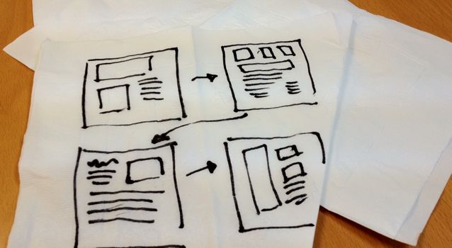
I created the diagram above (click the image to view full-sized) a long time ago (and updated it on 2012-06-04). I included it in a slide deck I was presenting to describe and clarify the BA role in the context of the organization. My intent with the graphic was to convey the notion that the business analyst’s output shouldn’t be seen simply as a specific document or set of documents in which “done” is defined as having completed all the sections of a canned template. I wanted to show that there are lots of common components which might be part of a good requirements model. I also wanted to emphasize that a good requirements model typically doesn’t need all of the above. In fact, trying to include too much can lessen the communicative value of a requirements model.
In my view, “a good requirements model” consists of whatever combination of textual requirements, visual models and other pertinent information is required to effectively capture and communicate (ideally recap) scope and requirements. Templates may come in handy, and in some environments, one project’s model may may be very similar to the next, but we don’t want to constrain the quality and content of our requirements to fit a cookie-cutter format.
I’m convinced that there is no perfect, fits-all template or set of documents which will be effective across all companies or even for all of a given company’s projects. The business analyst should work with internal and external stakeholders to determine which communicative tools will best serve for each project effort and model requirements accordingly.
You can view the full-sized image by clicking on the one above, and I’ve posted the original Visio (2010 format) for the diagram in case anyone might have use for it to reuse, tweak or re-purpose. Hopefully it will come in handy for a few of you. I’d also be appreciative of any feedback you may have on the content or format of the diagram.